
Movie posters really don't get that much credit. The movie poster is another form of advertisement for a movie, and unlike a trailer it has to give you a feel for the movie in one image. So while it is absolutely nice to see some posters get an extra amount of effort and care put into making them look nice, representitive and appealing, it's also really funny to see when that just straight up did not happen. So, yeah, today I'm looking at posters for animated movies that ultimately just don't really work. Why? Because I've always been of the belief that knowing why something doesn't work is just as important as to knowing why something does. When you look at bad art and know why you don't like it, you can incorporate that into your own art. So, let's see what we can learn from these ten examples of pretty mediocre and lame attempts at advertising.
I really want to stress this is not a ranked list, just a list of examples.
10. Kung Fu Panda 2

You know, I can forgive the first Kung Fu Panda movie for having a silly poster because, yeah, let's be real it sounds like a silly movie and that was probably why people were interested in it. It's just that beneath the surface of the silly Kung Fu movie for kids, was actually a very deep movie. So, Kung Fu Panda 2 comes out, and what poster do we get? Something that literally screams "We're the exact same thing the last movie was". In fact, it may actually be worse than that because ultimately, since the depth and nuance of the last movie was a bit of a surprise to people, now it seems like this movie is going to have even less of that, because just look at it, if this poster doesn't scream "The same but less" than I don't know what does.
9. Horton Hears a Who

You know, DreamWorks face barely works for DreamWorks movie posters, it works even less for what amounts to a lesser Pixar/DreamWorks movie studio. No offense to Blue Sky, but they did not have the best filmography before they were shut down. Anyway, this poster is hilarious, like change the title to "Harold and the Elephant" and you have a movie about a man who is having a psychotic episode trying to escape an imaginary elephant who is also a sex offender. Look, I'm just saying, making faces like that while behind someone is not something you do unless you're thinking about slithering in-between that person's buns.
8. Princess Mononoke
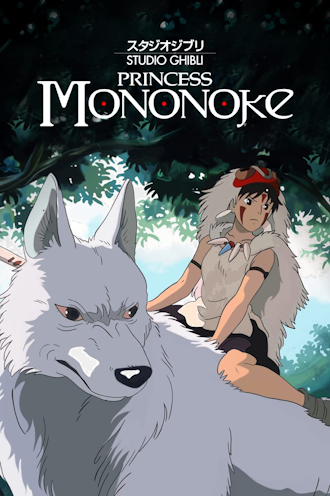
What does a movie about the war between man and nature and a looming threat of a dark entity really need to sell itself? A woman riding on the back of a wolf, that's what! Okay, truthfully, I can see this being appealing, like someone might look at this poster and think, "Wow, who is this badass riding the back of a large wolf?" and on that level, I can see this poster being good, but again, a poster needs to be some kind of representation of the movie itself, and I'm fairly certain that there's something a lot deeper in this movie than a woman riding on the back of a wolf.
7. Kubo and the Two Strings

You know, DreamWorks face barely works for DreamWorks movie posters, it works even less for... Actually I think the biggest issue with this one is that it just looks like a very generic action movie.
6. Zootopia

5. Missing Link

There is an awful trend of DVD covers just being close-ups of a character's face, it honestly kinda looks like Laika was just gonna cut out the middle man by making this the poster so they could make an easy DVD cover with minimal editing. On the bright side, the actual DVD covers are a step-up from this.
4. Tangled

3. Ratatouille

2. Kiki's Delivery Service

1. Ruby Gillman, Teenage Kraken

I... really should not count this one since, as of writing this, this movie isn't even out yet, but my immediate reaction to seeing this poster was, "Oh gosh, that is bad". It is simultaneously too much, and yet too little at the same time. There's a big battle going above, and a character just chilling out below, I mean, what? It really does appear that DreamWorks has no idea how to market this movie, because nobody really knows exactly what it's about, and this poster really doesn't help, hopefully the movie will be good, but this is easily one of the worst movie posters I've seen.
The movie poster is an important part of the movie going experience, they are often one of the first images we see of the newest movies, and in and of themselves are works of art. There are so many movie posters out there that are as enticing as the movie trailers, just with one still image. There are lots of pieces of art that I feel a lot of people overlook, like Movie Posters, Video Game Box Arts, Album Covers, and I want us to learn from it all. If you were making a poster for a movie, what kind of things did you see in these posters would you not do? Is there anything in these posters you would incorporate into your own work? Looking at and studying bad art is just as important as studying great art, and I think that is ultimately the thing I want you to take away from this post. These posters may not be great, but we can still learn from them.
No comments:
Post a Comment